UX CASE STUDY |
GROCERIES DELIVERY APP
a ux perspective
into making online grocery shopping more user centric
The problem statement
During the pandemic there was a huge rise in ordering groceries online, users have continued to avail this model due to its ease of use and accessibility though it tends to get hard for users to keep track of their groceries or identify items already available at their residence.
Research problem statement
Using a grocery app to keep track of products needed and bought can be very challenging. As a UX designer, you must first comprehend the purchasing patterns and shopping strategies of the various customer categories involved. To assist the company in providing services to the customers more effectively, plan research to determine the user behavioral trends.
THE PROCESS
Primary Research
Participants in primary research are those who make up your target user base. It gives us the chance to hear directly from people who are dealing with actual issues. The knowledge gained from primary data helps to clarify the nature of the issue and the best course of action for resolving it.Also, by analysing data in books, articles, journals and even previous surveys.I was able to better understand the sample space of users that we need to focus on to arrive at our target users.
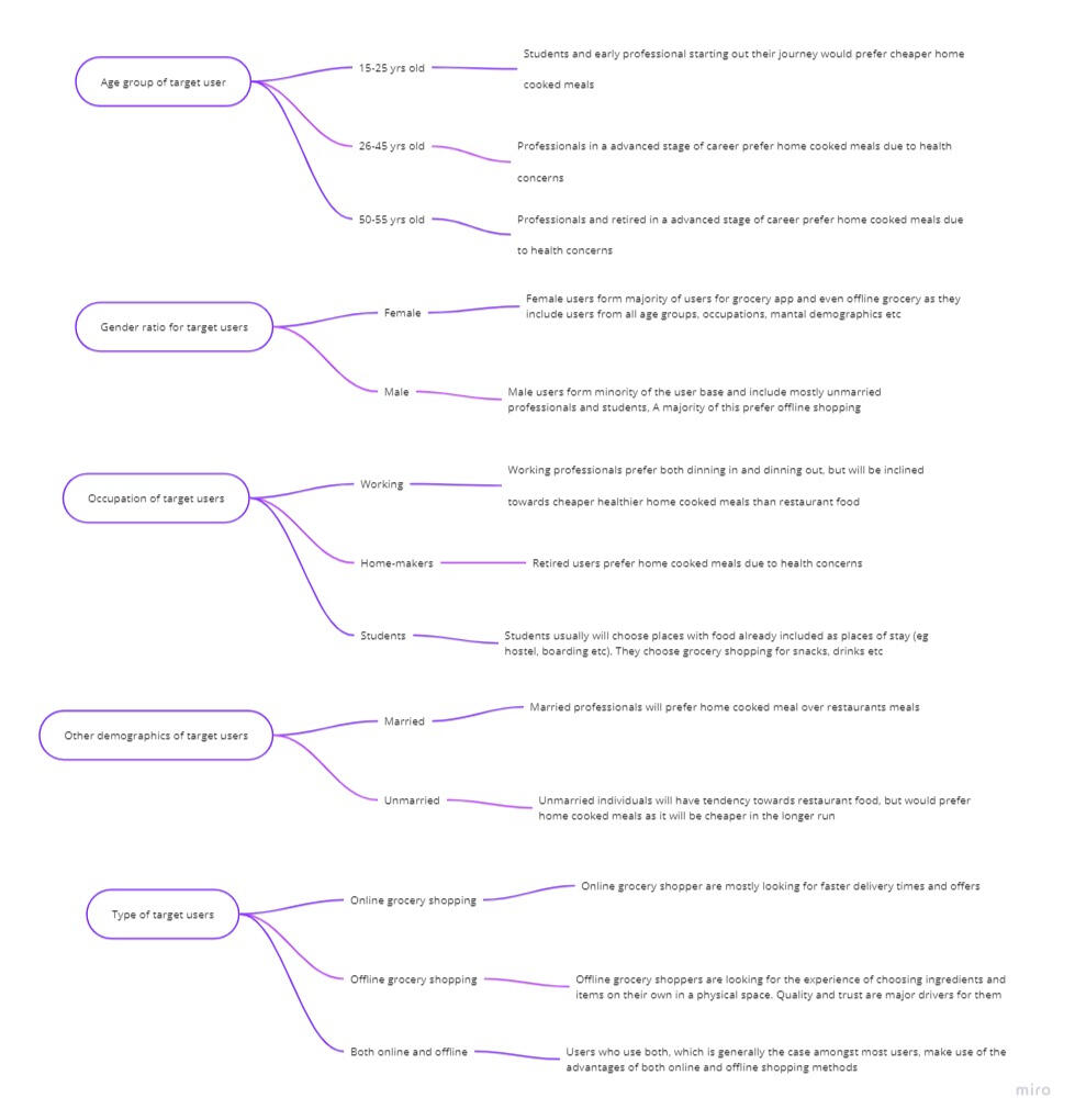
Once the target pool of users is identified, the next step is to find people in the real world who best suit the target set. I created a Google form, which had a series of questions to screen out potential people belonging to the target set. As a result of the screening activity, I was able to finally arrive upon 6 users. The users were selected on the basis of relevance to the target user group and minimum bias.


Research Analysis
After interviews, I created empathy maps to understand the users I’m designing for and their needs. I was able to arrive at forming user sets.To understand each user set further, we draw upon what each user set says, thinks, does and feels. This is what is referred to as Empathy mapping, and is illustrated below:• The Explorer — someone who is all about exploration.
• The Strategist — someone who plans and organises.
• The Sprinter — someone who plans on the go.


User Journey Maps
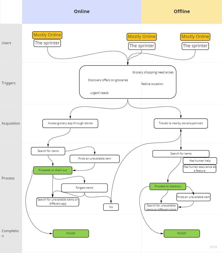
Pain Points
Problem 1: The tracking of groceries on the app is difficult.
• How might we make it easier for users to plan and prepare for grocery shopping?
• How might we help users find items and categories easily?Problem 02 — There is no human element in the app. As in a sense of assurance is missing.
• How might we include human assurance for online grocery shopping?
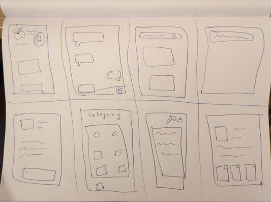
Ideate And Wireframing
Ideate
This stage is where we brainstorm for ideas to the statements from the previous stage. For this, a method known as ‘Crazy 8’ was applied.
How Might We make it easier for users to plan and prepare for grocery shopping?• Give an option of saving grocery lists as daily, weekly, monthly etc.
• Highlight previously ordered items using signifiers.
• Let the app help users save items once order is complete.
• Options of letting users know if a particular item is running out of stock.
• Remind users of items the have not added which they usually add at checkout page.
• Reminder system to let users know days before upcoming grocery shopping.How Might We make help users find items and categories easily?• Cleaner and simpler UI.
• Screens that highlight the product rather than unnecessary graphics which are confusing.
• Gives users the ability to see similar items.
• Add a signifier to always remind the user that a search bar can always be used.
• Items inside a category move out of screen space to show other items from the same category list.How Might We include human assurance in online grocery shopping?• Let user know the origin of products such as fruits and vegetables.
• Add tags to items such as vegan organic etc.
• Search bar prompts to help out the user.
• Star rating option by fellow shoppers.
• Adding comment section for seeing information provided by fellow shoppers.
• Highlight items being bought by other shoppers.
• Adding expiry date information
• Adding recipe tab for fruits, vegetables and edibles,
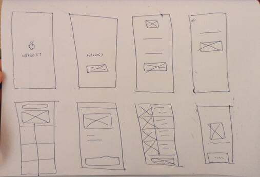
Paper & Digital WireframingThrough wireframing process I am trying to solve the following problems:• A list feature that automatically adds items purchased into personalized lists. The items from the list will be signified throughout the app to help users not forget items while shopping.
• An information add-on to let users know the origin of products on the individual item screen.


High Fidelity Prototype, Usability Testing & Final Prototype
High Fedeility PrototypeI am able to develop a thorough understanding of the UI layout due to high fidelity wireframes. It enables me to consider all possible interactions before moving on to the final UI and prototype. I observed that as I moved to High - Fedelity, both diversity and clarity were visible. This gave me more time to consider the solution.The final solutions selected from the iterations contain the following insights:• Introducing an access pathway to the new feature on home screens and other existing screens.• A better design in terms of usability, practicality and which draws inspiration from how things work in the real world.• Designing for the solution keeping in mind not to disturb the existing ecosystem of the base app.• Thinking on the micro-interactions between components introduced, their relationships and states they might have.User TestingI selected 3 individuals from PRIMARY RESEARCH for the testing phase. As a result, I was able to fully understand the users I spoke with and carry out the testing phase.The following insights were gathered from the testing stage:• All of the users liked the idea of a favorites list feature being added to the grocery app platform and were easily able to identify to the ‘favorites lists screen button’.
• Some users pointed out the need to make favorites list feature aware for first time users.
• One of the users suggested the inclusion of a microphone option for the search bar, which will allow the user to add items to lists via voice input.
• Most users felt that the additional information about where a particular item was sourced from gave them a feeling of trust and assurance.
• Users felt the need to have a filter or sort function. Where they are able to sort all the products by price, type, etc.After going through the insights, the features I decided to work further on are listed below:• I understood the list feature was an important improvement in the grocery delivery app experience as suggested by my users, and so decided to go ahead with it.
• To make new users aware I decided to add an information pop-up that appears on the screen to guide the user.
• I also added a microphone option on the search bar for speech recognition.
• I decided to stick with the feature of an item’s source information, as it made sense to most of the users and allowed them to trust the experience.
• I included a feature for a filter or sort function in the search results and categories screen.Journey from Paper wireframes to final prototype:


KEY LEARNINGS• I became aware of the value of research and how it may help us navigate the large ocean of knowledge and viewpoints. It establishes the framework for the whole design process, serving as a reminder of what is significant and why.
• I discovered the value of "non-textbook learning" and how to acquire knowledge through experience. This strategy really pushes us to understand the rationale behind each phase of the design process and deepens our knowledge. In this way, I am constantly eager to learn and advance.
• I also discovered how crucial it is to ask questions. Questioning everything enables us to reach a higher level of understanding. A deeper understanding generates deeper insights, and better solutions are generated by deeper insights.
Now, let’s work on your project.
Copyright Ⓒ 2022 Raghunandan